My Blog List

Lizzy Boo!!!

My photo
Houston/Huntsville, TX

Thursday, September 30, 2010

10 quotes

1. You're my home sweet homicide
2. She was a teenage zombie
3. Cold dead lips and a crooked spine
4. I walk with a Zombie
5. We'll find a new place to haunt
6. I'm in love with a decomposing zombie
7. My monster girl's too dead to die
8. I'm so love sick, sick of you
9. You'll be the death of me
10. On that day, my heart died

lyrics and song titles from two of my favorite bands! I cant wait to try to express them with ink and paper!!!!

Monday, September 27, 2010

Menil Questions

a. The most enjoyable thing I saw was the Flavin installation. I like the way the colors were set up in a constant pattern according to colors. It made me want to dance, I felt happy.
b. The most disturbing thing I saw was the Pestle in the form of a Phallus, I feel uncomfortable looking at human private parts. The similarity it had to a mans penis was a little shocking.
c. The piece in the museum I would most likely make is a Cy Twombly painting. I can't really draw but I do like weird and abstract painting so a bunch of scribble like Cy Twombly's painting is what I would most likely be able to do.
d. What made me curious was how can some of the artist for example Mark Rothko's Plum & Brown was made. How can someone work with such a big scaled canvas.
e. I believe the Rothko Chapel building structure along with the way the inside is set up really helps his paintings and make everything come together nicely. It isn't overwhelming its actually very simple just like the paintings themselves.

Sunday, September 26, 2010

Human Composition

Composition # 1

Composition # 2
Original pieces

This was a fun project to do I think we all had fun doing it as well as a little stressful time for us. The way the dots were position according to the way the bodies were laying I think was the hardest part. Figuring out the best way to set the dots and getting a good photograph of it was also a challenge. We didn't have enough fabric to cover the entire space we would need and I forgot to wear black socks so that was also a problem. Some of us wanted to cover up every visible skin area that was revealed so that it wouldn't distract from the focus point. All in all it was fun.

The Menil Collection Fieldtrip

Tony Smith Sculpture
This was an awesome field trip we took although I have been to this museum plenty of times, I enjoyed the Rothko Chapel it was my favorite a long with the Dan Flavin installation. I loved all the colorful lights it made me want to dance or something. I also like the chapel because of its big black and violet paintings and how quite it was. The Menil Collection has a great amount of artwork and the best part of it I can go see it when ever I want and its FREE!

Human project Brainstorming


1. naked
2. wear black against white background
3. disappear against the white background
4. black fist
5. gloves as circles
6. hang glide over Jamaica
7. human pyramid
8. underwater dots
9. laying on floor and taking pictures from above
10. oreo's and milk
11. chocolate chip cookies
12. gladiator costumes

Natural Form Studies Drawing

my cardboard sketches
So before we got to work with our cardboard we had to experiment with our items and draw sketches to get an idea of the details on it and get a feel of how we would be able to create 3D objects out of cardboard. My cardboard felt hard and I didn't know how I would be able to bend and manipulate it to make it look like my object. I've never worked with this material before and I was shock when I first heard our goal was to make it as big as possible.

Monday, September 20, 2010

Text as Texture Image

my best 4 texture                       my text as texture book
This was an interesting project to do we had to try and continue improving the way our dots or square compositions could look. Adding texture as the background with only newspaper, I couldn't find many ways to arrange the newspaper in a way that could make the composition improve. I did like these four out of the eight, at first I started very flat not a lot of 3D to my backgrounds. I tried to glue circular objects to the piece to make it stand out but they wouldn't just stayed glue, so I had to give up on that. Next, to add more "pop" I started to glue the newspaper in a way it could have some 3D form which is how the first composition came about all I have to do is figure out a way on how to get my circles on it without making my piece flat. I think I'm might have to spray circles on it with spray paint to get it to look good. 

The Exquisite Corpse part II

"The lonely flower sits a cloudy sky"

This wasn't too hard but I did have trouble figuring out which image to put up, I took different ones to relate my sentence to the image I took some of single flowers but I couldn't find cloudy day when I was taking the pictures, on my drive back to Houston the sky looked really nice it was sunset and with plenty of clouds so I decided that would be the image I would use to express this sentence.

Sunday, September 19, 2010

Lecture/reading summary 9/17

In lecture we went through different art movements some of the ones we touched on were Post Modernism was a shift from a dialog taking place in person in New York and Paris, to a mediated dialog through art fairs and media. Modernism, was a rapid progression of styles it was transgressive or opposition to mainstream society. Impressionism, was popular among the artist Monet. Post-Impressionism, consisted of inventing not copying. Fauves/Cubism many countries had different styles they like to use but a famous artist of the time was Pablo Picasso.

Final Cardboard Critic

My strawberry                                      Detail top
So my group gave me very good critique, they said that it look very much like a strawberry and that the detail on the top of the strawberry was the best. They also like the way I cut out the body of the strawberry to give it a little more detail from how plain it use to be. The only thing they did tell me to make my piece improve a little more was to find a way to make the body of the strawberry more round shape. I initially began with an acorn shape and was planning to bend the cardboard so that it would become more round, but once I glued the pieces together it became flat again. I might have to do what Mrs. Kelly said and try to cut out piece by piece and glue them together in a round shape instead of trying to work with one whole piece.

Tuesday, September 14, 2010

Squares

8 square

The reason why I pick these 8 out of all my other sketches was that I thought these were more diverse and because I had fun doing these. I tried to show touching, overlapping, union, and detachment on some of my sketches. I did find drawing squares to be easier and less stressful than trying to get perfect circles. I'm also thankful we didn't have to draw 40 different sketches, thank you Mrs. Kelly =]

my playful/periodic mounted below my dots

The Exquiste Corpse

                                                      "The lonely flower sits a cloudy sky"

Playful/Periodic Critique

playful/periodic
My square critique wasn't what I expected but then again that's because I was the only one who could tell which final composition was which. My group told me that they weren't too clear on which one was periodic and which one was playful, I had to add more squares to my periodic to make it look periodic and for my playful composition I could maybe rotate and move some squares to make it more playful. I need to play a little more with the position of the squares, they said they saw continuance in both the compositions also my frames were good I had equal amount of negative and positive space and they all agree that my squares were neater than my dots. I look forward to improving both my dots and my square composition, I also do agree that I could do something else to make my square composition more playful.

Lecture Summary 9/10

Creativity is made up of a lot of different words, everyone in class having a different opinion on what creativity is to them. According to the readings no one is more more creative than others some just choose to use their creativity and expand it more, while others simply believe they can't be creative. Some of the words that we came up for creativity were playful, adaptable, intellect, awareness, most of us don't use these when we create a piece of art and its something we should keep in mind in order to make out piece more original. There can also be Blocks for example some could include physical, cultural (taboos) or even fear itself. I can relate to these blocks because sometimes I do care about what other will say or I am afraid I will not be able to accomplish my task or goal. To solve this we have to understand the problem and device a plan to solve, adapt, modify, or even substitude it. Think outside the box.

Wednesday, September 8, 2010

2D Dots project 1

Final 4 mounted on wall


I'm happy with my final 4 dots project and its outcome, now I'm just a bit nervous about the critic we all have to do for each other's final projects. I'm also glad its over and that now we get to move on to working with squares instead of dots. Next I will have to pick my two final square drawings and pin them on the wall next to my Dots. It wasn't such an easy project but after a lot of hard work I'm glad it looks presentable.

Friday, September 3, 2010

Reading summary/Lecture #2

I really like the readings we had to do because I agree with the most part to what it said. What is art? Other people may consider what you consider art not art at all. Everyone has a different way at seeing what art is, some consider art things they can relate to or is appealing to them. Art doesn't have to be something beautiful at all times art can be ugly as well. According to lecture art has to be something an artist thought of, or an image of a person, it has to inspire thought and emotions. There are also representations, one thing stand in for another. Different styles of representation are naturalistic: as in nature, realistic: true to life, stylized: simplified to emphasize important details, abstract: highly stylized (may not be recognizable), and non-representational: art not based on the real world. I believe art is in the eye of the beholder because everyone has a different way of seeing things and likes and dislikes so I can't really argue with that.

Cardboard Madness

my first cut out                with a few detail
The first week working on this seem crazy I had no idea how to recreate my strawberry out of cardboard. I thought that it would be easier to just start out with the piece with less detail as possible. It was my first time working with cardboard and I didn't think it would be so hard. I really had to use pressure to cut through the cardboard and that didn't work out so well so what I did next was just use sand paper to smooth out the edges of my cardboard and get it as rounded as possible. The top piece that the strawberry is attached to was a little more difficult, I didn't know how to make it round or get it to cover the opening in between my strawberry shape. So what I did was just cut out a round piece glue it to the sides of the strawberry shape and start with the detail which will eventually cover up the top of the strawberry and all around as well.

Reading Summary

Gestalt: was mainly about the understanding that "the whole" is different from the sum of all of its parts. The German word Gestalt means, entired figure or configuration. The four principles of gestalt are:
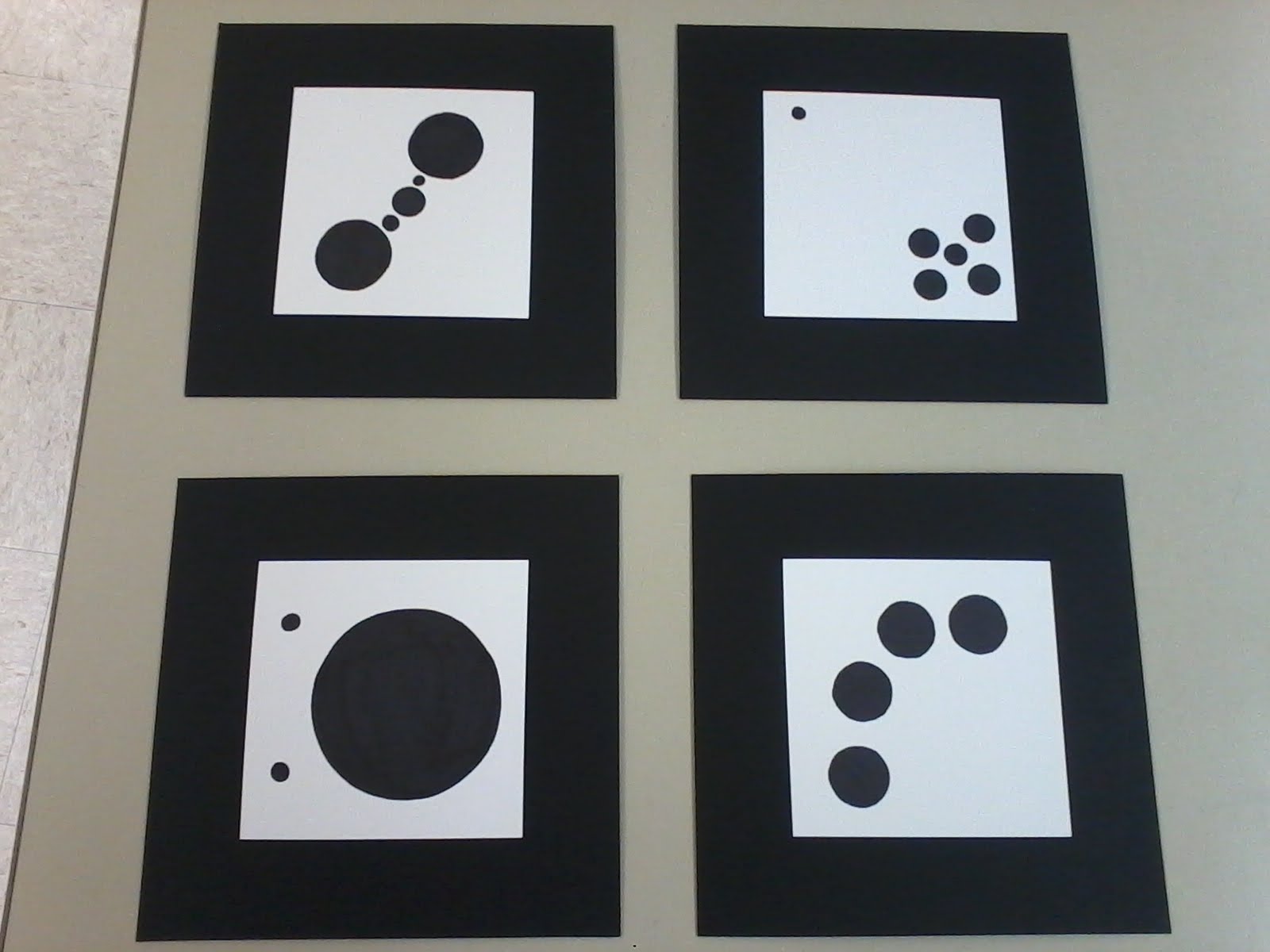
 closure, continuance, proximity, and similarity. All these are visual elements that trick the eye into seeing beyond what they want to see. Depending on the position they are place and the amount of space between an object can make a big difference.

Formal  matters: talked about form and content. Form being a visual element made up of line, scale, shape, size, color, and composition. Content on the other hand was expressed through form or sometimes even as form. Formalist mainly focus on shape color and materials while Modernist think art history is a progress toward greater art in each medium.

Principles: Design is a process of purposeful visual creation. A good design is a visual depiction of "something". Visual Language is the basis of design creation. These are the principles, rules, or concepts that a designer must keep in mind.
Four groups of elements: are distinguished by conceptual elements: not visible, visual elements: what the eye can see, relational elements: for example position, space, and direction, and practical elements: are made up by representation: which can be realistic, stylized or near-abstract, meaning: the design must convey a meaning, and function: the design is made to serve a purpose.

Form & Composition: Geometric forms are made up of circles, triangles, squares, or combination of all these. Organic form is fluid in appearance. Harmony, simplicity, and rhythm make up a visual composition. Harmony indicated a grouping of related components while simplicity is a form with a limited amount of simple elements. Rhythm is the movement from an idea to a compositional area to the next.

Interview: Piet Mondrian talked about mainly how to express ideas or messages through art, it can be as something very realistic like drawing or trying to imitate nature of something abstract like Picasso who simply put geometric shapes together to make a form of a man. It is the message or the reaction the artist wants to bring out in the audience which makes the difference.

Thursday, September 2, 2010

My Critique

In my critique my group told me that a lot of my dots had a similar form. The size of the dots didn’t have a large range in size. There was only one size to my biggest and a similar size for my smallest dot. The bigger dots took over my space and there wasn’t enough negative space in the square for the rest of the dots to pop out. I didn’t want mine to look like everyone else’s which is why I chose to exaggerate. I wanted the big dot to take up most of the space so that it could look as though it was over powering the littlest dot. I also tried to use in most of my 40 sketches the least amount of dots to portray one of the four Gestalt principles. By looking at my work you can tell that there was direction in most of the compositions there was also a focus on the position and form the dots had. I tried to keep my dots organized and not all over the place. Next time I’ll try to make it more spontaneous and less disciplined. I didn’t like the fact that we were constricted into using only 3-6 dots I think that was the main problem that didn’t allow me to expand my ideas. The limited amount of space to draw on was also another challenge, but at the end I was able to come up with 40 different sketches. I did run out of ideas and so a few of them were created out of boredom and non creativity.

too many Dots

Final 16

Final 4

So after staying up so late to work on 40 drawings of dots, it finally came down to only the best 16 of the bunch. I was given some good criticism from my group to help me narrow those 16 down to 4! I think I'm really going to hate circles from now on, but I'm happy with my final four and they look great nicely framed.

Framed

Wednesday, September 1, 2010

Dots Dots Dots

On Monday we started our Dot Dot Dot project, I was excited because I'm a big fan of anything black and white and pok a dots. It seem like an interesting way to assemble these dots in a way that we could create closure, continuance, proximity, and similarity. The downfall was having to do 40 of these and each different from each other, I didn't think it would be so hard. Then not only did we have to do a thumbnail sketch but also after that we had to redo them into 6x6 square transparent sheets. It took me for ever to do them and now we have to pick our best 16 and narrow them down to our final 4. I think I'm going to have another long night with Dots, my obsession with pok a dots will be ruin now.

Friday's Lecture

On friday for lecture, again it was a whole new experience not only was Mrs. Kelley giving lecture but there was also a powerpoint presentation for visual help. Once she was done with speaking about the composition, elements of design, rhythm, and The Whole, she had us perform as a group the different elements of design using only our body to make sound that would describe the element. Our group had to figure out how to sound out Shape. The only thing we could figure out was to place ourselves around the class in a circle form and start clapping slow to fast. We had to change this up because other groups were using clapping as part of their sounds as well. Then we decided to just go ahead and add more sounds to it and so we came up with clap, stomp, snap. It was a fun lecture.

Cinder Block

The first day of class was really interesting, most classes you just start out with an introduction of who you are and you get to meet and know a little about everyone. In art that morning the first thing we did was actually a project right away, we were given newspaper and tape that was it. We were suppose to build a structure that could hold a cinder block off the ground at least three feet. I had no idea how newspaper would be able to hold a cinder block! That thing was heavy but I still tried, my structure didn't make it to three feet high but it did hold the block off the ground at least 12 inches. I was amazed that newspaper wrapped up really tight can actually hold a cinder block. It was a fun first day of class.